PFEIFER UND LANGEN
Soft relaunch of the Diadem Sugar Range.
Diadem was to be positioned as an independent brand for Aldi.
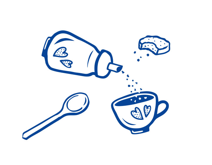
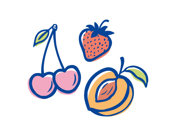
The loving illustrations contribute to the uniqueness of the design.
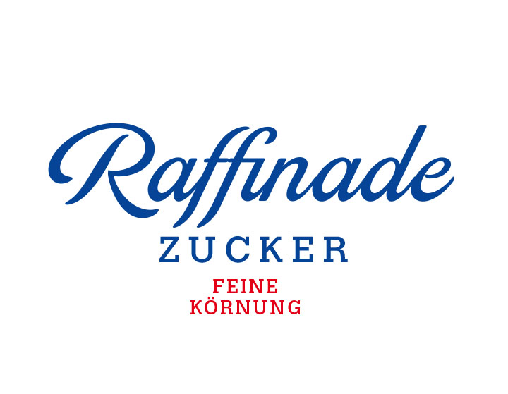
The Diadem logo was also slightly modernized with the new typography.
The typography of the product names refers to the baking world.
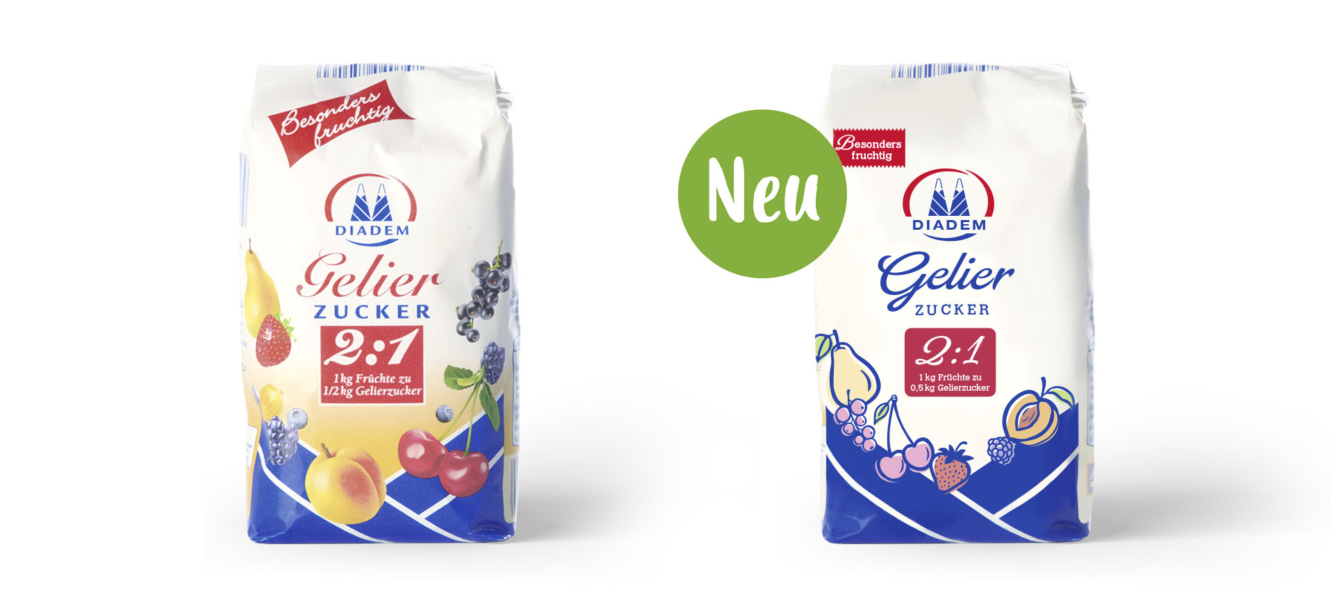
The juxtaposition shows the high level of recognition,
but the new design appears tidier, more structured, clearer and fits in with today’s times.
